
Color drenching reduces the visual breaks and provides a warm, seamless, continuous, and flowy look of the whole room or space. Also, color-drenched rooms are styled with compatible architectural furniture, which makes the look even more aesthetic.
Have you ever entered a room and found every entity in it the same color? Well, that is called color drenching. Color drenching is an interior design technique in which you paint each wall, door, trim, window, and ceiling the same color. People choose this trend to give their living spaces a bold, warm, and unique finish.
In this detailed article, we will study what color drenching is, its benefits, and how to experiment with it in different rooms in our houses, as well as some common mistakes in the process of color drenching.
Table of Contents:
- What is Color Drenching, and Why Is This Trend Popular in Modern Homes?
- Color Drenching vs. Monochromatic Design vs. Accent Wall Design
- Color-Drenching Ideas for Different Rooms
- How to Color-Drench Your Room Step by Step?
- Suitable Paint Color Palettes for Color Drenching
- Common Mistakes to Avoid While Color Drenching a Room
- Conclusion
- FAQs
What is Color Drenching, and Why Is This Trend Popular in Modern Homes?
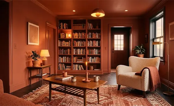
Color drenching is a popular color-coded design technique in which all the walls, doors, windows, trim, ceilings, and even the furniture or architecture are given the same color. This trending style not only gives your rooms a monochromatic look but also gives a sense of a unified, calm, and harmonious feel.
Did You Know?: The color-drenching technique is not new; it originated in the Victorian era, when they used to paint small spaces like offices and libraries in the same color to hide imperfections like radiators and trim, and also to make the space feel more private and calm.
Below is a detailed description of why this color-drenching trend is becoming popular in modern homes and living spaces.
1. Monochromatic and Calming Effect
Instead of using expensive and different shades of paint, color drenching needs only one color for a whole room and still provides a calming effect that feels pleasing to the eyes. It gives the sense of monochromatic design without any visual breaks. Your eyes analyze the room in the same pattern from every corner, which creates a warm and healing effect.
2. Small Spaces Also Feel Larger
When you move your eyes throughout a color-drenched room, they do not stop at the boundaries or corners of walls. Drenching reduces the contrast lines between the borders and corners and creates a smooth, continuous visual spectrum, so your mind doesn’t focus on the dimensions or area of a room. Hence, the small spaces also seem larger and more spacious.
3. Define the Architectural Details
While the whole room is painted in the same saturated hue, it gives the architecture of your rooms, like furniture, moldings, panels, lamps, paintings etc. to shine and attract the people’s attention. Drenching enhances the material presence and gives a warm depth to the room.
4. Gives a Luxurious Yet Classic Feel
Monochromatic painting hides imperfections, such as exposed pipes, radiators, etc., which are quite visible when painted in different colors. But when the room is painted in the same hue, your eyes cannot take note of the distracting features of the room, which makes the space feel more defined, luxurious, and rich.
5. An Easy-to-Apply Option
You don’t need to think about the matching tones or shades for the walls, but the one color you choose is the key element that saves you planning time. Color drenching eliminates the need to make wall boundaries or stick tape on trims for a perfect coat of paint. You can fearlessly do the painting without worrying about wrong strokes on adjacent walls or trims.
Also read: Top 10 Best Types of Exterior House Stone For an Elegant Look and Durability
Color Drenching vs. Monochromatic Design vs. Accent Wall Design
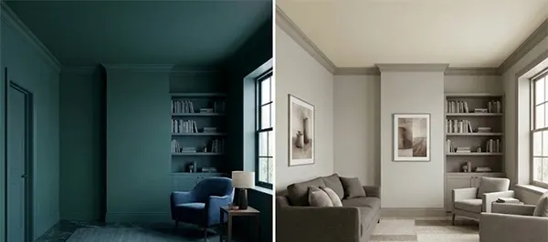
Color-drenching, often called monochromatic design, is understood completely differently from accent wall design. But there are certain similarities and differences between all three of them. While color-drenching uses a single color for the whole room, monochromatic design is about using different shades of the same color, and accent walls mean only one part of the room is given a contrasting look, and the others are kept neutral.
Take a look at the detailed differences between color drenching, monochromatic design, and accent wall design.
| Differentiating Aspect | Color Drenching | Monochromatic Design | Accent Wall Design |
| Meaning |
|
|
|
| Look and Feel of Room |
|
|
|
| Size of Room |
|
|
|
| Best For |
|
|
|
| Cost of Painting |
|
|
|
Also read: Drywall vs. Sheetrock: Types, Benefits, and Installation Cost of Drywall
Color-Drenching Ideas for Different Rooms
Different rooms of your home have a different feel, and they require different treatment. Bedrooms need to be relaxing, bathrooms need to be calming, and living spaces need to be inviting and warm. But before jumping on the trending ideas for different rooms in your house, you must have a look at some of the necessities that you might consider before planning for a color drench, as given below.
- Select the Surfaces to Drench: Decide whether surfaces like trims, doors, windows, and baseboards will also be covered in drenching or not.
- Compare Colors of Other Entities in the Room: Also consider the floor color, door design, window frames, ceiling work, tiles, etc., to complement well with the shade you are going to choose.
- Type of Finish: Not only the shade or tone, but also decide the type of finish by testing on some samples.
- Look for the Existing Damages: Inspect the whole area or room for any hidden structural damages and ensure priming the surface before applying the first coat.
Below is the detailed description of the color-drenching ideas for different types of rooms with finishes.
1. Living Rooms

A living room is a perfect balance of an open, inviting space and a homely relaxation point. The room needs to be more welcoming, so the colors used should be warm. Earthy colors, warm greige, navy blue, forest green, etc., are the types of warm tones that work well for drenching living rooms. Ceilings can be kept in a different color with ambient lighting to create a difference.
Eggshell or matte finish on walls and satin finish on trim and frames work well in living rooms. With warm lighting, the furniture details are enhanced, making the atmosphere look rich and textured.
2. Bedrooms
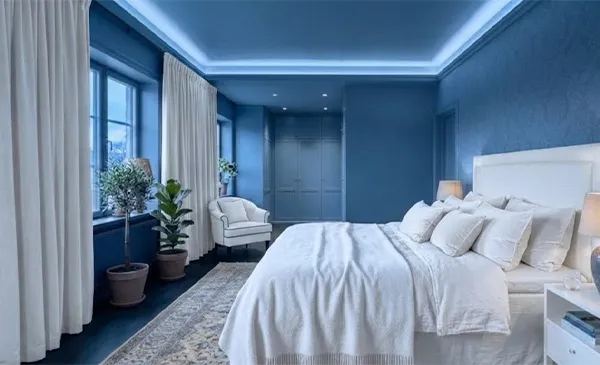
A bedroom can be designed for two kinds of perspectives: one for night and one for day. For people who want the colors to work perfectly for both day and night, they can go for warm beige or greige, soft blues, sage greens, or muted pinks.
For the type of finish on walls, you can opt for flat or matte sheens; for ceilings, keep it flat; and for trims and frames, choose the satin finish to highlight the boundaries that create a soothing and cozy environment. The furniture, like beds, cabinets, tables, etc., should look different from the wall paint color to avoid monotony.
3. Bathrooms
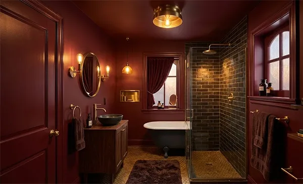
Bathrooms are compact spaces where the size of the bathroom determines the color of the walls. For large bathrooms, shades like navy blue, forest green, and terracotta clay work well with warm lighting. Also, for smaller bathrooms, shades like wine red, charcoal, black, and rich browns work well with warm lighting and brassware. For the type of finish, you can choose stain or eggshell paint for walls and ceilings and semi-gloss for trim and doors.
4. Offices and Libraries
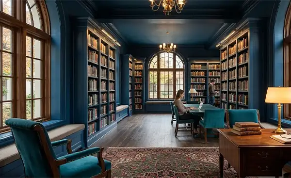
Libraries and offices are places where extreme focus is needed to study and work. For creating a focused and warm environment, shades such as inky blues, forest greens, rich teal, and warm greys are good options. On the walls and ceilings, use matte or flat finishes, and for rims and window frames, use satin or semi-gloss finishes.
5. Hallways and Staircases

We generally don’t consider or bother about the hallways or staircases while planning for a color scheme, but including these in the design gives your house a clean, uniform look. Colors like navy blue, muted grey-green, beige, chalky white, or soft off-white look good, as they are minimal and look good in open spaces.
For stair treads, handrails, newel posts, beams, and frames, you can choose the satin or semi-gloss finishes to highlight the boundaries, and for ceilings and walls, you can opt for a flat or matte finish that gives a wholesome look.
Also read: What are the Stair Railing Height Requirements? Handrail and Guardrail Height for Safe Design
How to Color-Drench Your Room Step by Step?
For color-drenching a room step by step, firstly, you must have the essential items like paint, brushes, tape, paint rollers, primer, scrapers, and other small and useful tools. Below is the step-by-step process for color drenching a room.
1. Choose the Color According to the Space

According to the type of room and the mood you want to create, choose the paint color, keeping in mind the undertone of the color in different kinds of lighting. Decide the portion to be painted and check the quality of the paint before starting the process.
2. Prepare the Painting Area

If priming is not done on the walls, apply a fresh coat of primer on the walls and let it dry for some days. Remove the furniture ahead of the walls and cover the floor with a damp cloth, and cover areas not to be painted, like trims or frames, with tape. Clean the walls and the whole painting area with a sponge to wipe off the dirt on the walls so the paint can adhere well to the walls.
3. Consider the Ceiling Paint First

Start the process with the ceilings. The uppermost work should be done first so that it does not ruin the coat of paint on the other walls. Firstly, paint the edges where the ceiling meets the walls using the brush, and then paint the inner portion using the paint roller. Apply two coats of paint and let it dry.
4. Paint the Woodwork

After the ceiling is done, it’s time to paint the extra siding, trim, frames, baseboards, etc., other than the walls. To make the color-drenching effect look more overpowering, you can use the same color as the walls, or you can use a satin paint in a different color to create a unified look.
5. Apply the Core Color to the Walls
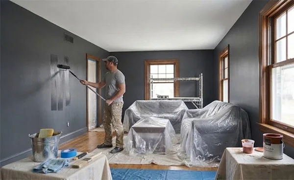
Now, it’s time to apply the core paint color to the wall. Start alongside the edges and then work in the center. Use the M or W technique to apply the paint to the wall with the paint roller. Apply the second coat of paint when the first coat dries completely to ensure that the paint will adhere completely to the walls for longer.
Wallinsiders Tip: Apply the paint using the M or W technique. This is a painting technique in which you apply the paint-loaded roller on the 3-by-3-foot section of the wall by writing the big “M” or “W” letter and filling in the extra gaps with even strokes.
6. Give the Final Touch
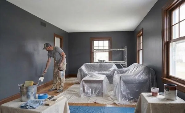
After all the painting work is done, have a look at the whole painted area and see if there is any patch left to paint. Paint the remaining portion, and when the paint has completely dried, remove all the floor coverings and tape, and assess the look of the whole space to check for any imperfections. Lastly, clean up the mess and put the furniture in its place.
Also read: What Do Interior Designers Do? Key Roles, Types, and How to Become an Interior Designer
Suitable Paint Color Palettes for Color Drenching
Not all color palettes suit drenching a living space. The color depends on the size and type of the room and the surrounding atmosphere, and the furniture also determines the shade and tone that will work well on the walls. Below is a detailed description of different types of colors used in home remodeling that suit walls well for color drenching.
1. Dark Shades of Blues
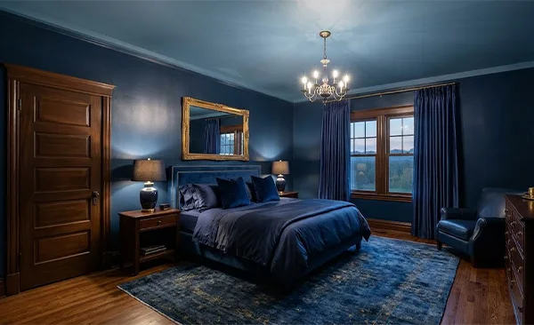
Blues, like navy and midnight, suit well in bedrooms to create a more dramatic and intense look in satin or semi-gloss finishes. These colors complement the semi-gloss-finished dark brown trims, frames, and doors. They provide richness as well as sophistication to a room that feels premium. The same color or a lighter shade of the same color is suggested to be applied to the ceiling to give a uniform look.
2. Forest Green
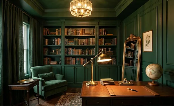
Like blues, greens also carry a calming and dramatic look with warm lighting. This shade is generally used in bedrooms, offices, and libraries for a focused and work-oriented environment, and it is also done in a satin or semi-gloss finish. The paint complements well with the brass or golden architecture and warm lighting to give a luxurious or rich-looking feel.
3. Rich Burgundy
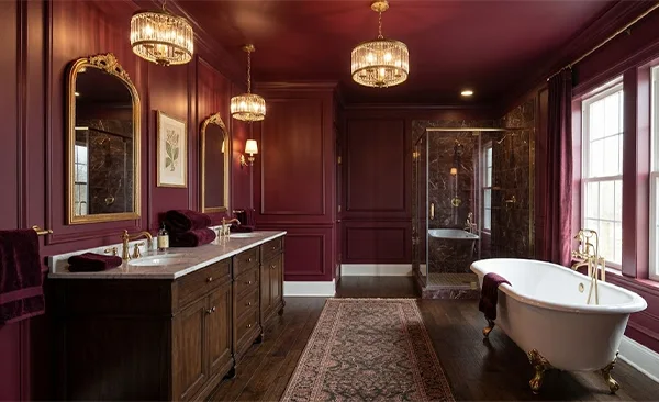
Rich burgundy is a versatile color, as it suits well in any kind of room, like bedrooms, bathrooms, living rooms, and libraries. Only the paint finish will change for the type of room. It creates a dramatic look and feel with a cozy and pleasant effect.
Trims can be painted either white or light brown in a satin finish. The ceilings can also be drenched in the same color. Wooden furniture and flooring work well with this color.
4. Sage Green

Sage green gives a muted sense of nature to the living space. It gives a calming effect due to its neutral to bold shade. This color suits well in bedrooms, living rooms, kitchens, and even bathrooms in a flat finish, with siding and trims painted in an eggshell finish. It also suits well with warm oak and maple wood furniture, with some golden and brass lighting or architectural fixtures.
5. Warm Grey
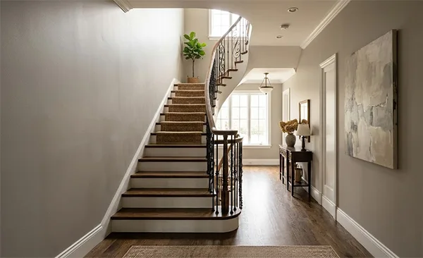
Warm grey gives a soft effect with a neutral base. It looks good in the bedrooms and dining rooms in a fully matte or flat finish. Trims and frames are painted in the same color in a satin or semi-gloss finish to provide that uniformity. Warm wooden furniture with old brass or gold hardware suits well with this color.
6. Warm Taupe
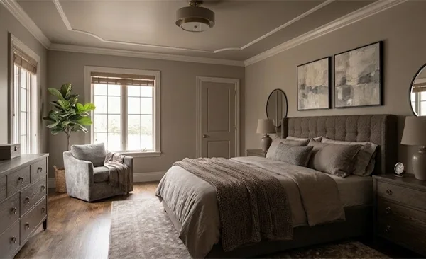
Taupe is a mixture of brown and grey, a grounded color that is versatile and is used in bedrooms, bathrooms, and even living rooms. It gives a neutral undertone with a soothing and calming effect that feels warm and cozy at the same time if painted in flat finishes.
Trims and molding need to be painted in a satin or semi-gloss finish. Wood-grain furniture with brass hardware and even matte black hardware, like mirrors and cabinets, also suits well with this color.
Common Mistakes to Avoid While Color Drenching a Room
Common mistakes that homeowners make while color-drenching a room are choosing the wrong finish and color for trim and walls, respectively, overlooking the boundaries and small details, and forgetting to prep the surface. Have a look at some of the common mistakes to avoid in the process of color-drenching a living space.
1. Choosing the Wrong Finish and Color
Using lighter shades for small spaces and using shiny sheens on the neutral walls looks strange. The color should be decided according to the room size and the surface type. For example, use warm to neutral shades for bedrooms and living rooms, cool to neutral shades for bathrooms, warm shades for libraries, and cool to neutral for office spaces.
2. Ignoring the Undertone of the Color
Colors appear different in different lighting conditions. A light shade may look dark in LED lighting, or a dark shade may look yellowish in warm lighting. People choose the shades for drenching purposes by seeing them only on a phone screen or in a paint sample book. You should always check the colors in daylight as well as in different lighting conditions to know the compatibility of color.
3. Neglecting the Small Details of the Room
Small details of the room, like switchboards, trims, baseboards, window frames, etc., are sometimes neglected by the homeowners. They paint them either white or brown, without bothering about the cohesiveness of the color with the walls.
Instead, you should also plan their colors prior to the painting process. If drenching the same color as the walls, then carefully choose the type of finish; if not, then choose the most compatible color that can blend well with the wall colors.
4. Blindly Following the Drenching Rules
People think that drenching means everything needs to be in the same color. They blindly color the whole room in a single color, which sometimes looks strange on the walls. So, visualize the whole room in a single color, and if you don’t find it aesthetic, then experiment with different color options for trims, siding, and radiators. This enhances your creativity and gives your living space a unique look, making it even more visually appealing.
Note: You should use modern paint color visualizer apps that allow you to take a photo of your living space, analyze the edges, furniture, and even the lighting conditions, apply different paint colors virtually from the manufacturer’s paint options, and show the real-time paint undertone with the different lighting throughout the day.
5. Forgetting About the Overall Look of the Living Space
Painting the two rooms completely differently and keeping the hallways and corridors in a lighter shade can create a sense of disconnect in the adjacent spaces of a single house. Also, the rhythm and cohesion fade away. So, when planning a color drench, keep the house’s overall harmony in mind.
For example, while transitioning color options from one room to another, keep the transitioning parts like hallways, doors, corridors, and staircases in some intermediate shade, and keep the flooring, ceiling, and lighting consistent, almost the same, for the whole house.
Also read: Exterior Painting Cost in 2026: A Guide to Getting the Best Painting Prices
Conclusion
Summing up! In this article, we discussed the color-drenching benefits, its process, and drenching techniques for different rooms. Color drenching is a technique in which the whole living space/room is painted in a single core color, including the walls, trim, ceiling, frames, etc.
While planning for a color drench, you must consider the overall look and feel of the house, the color undertone, texture, and lighting conditions, and also check which color options will suit your living space according to its size and orientation.
FAQs
How does color drenching help to make a boring room look more aesthetic?
Which rooms of the house can be color-drenched?
Bedrooms, bathrooms, living rooms, and even offices and libraries can be color-drenched to make them feel warmer, cozier, and more focused.
What is the difference between a color-drenched room and a monochromatically designed room?
A color-drenched room uses a single core color for the whole room, including the ceilings and the trim, but a monochromatically designed room means the whole room is painted in a single color with different undertones on different walls and ceilings.
Which furniture suits well for the dark color-drenched room?
For the deep colors, creamy white furniture with LED lighting works well. For warmer shades, metallic accents and even sofas with similar tones and warm lighting work well.
How should the trim, siding, and doors be painted for the color-drenching process?
The trim, doors, and siding of the color-drenched room can be painted in the same color, keeping the finish of the paint different. Instead of using flat or matte finishes, use satin or semi-gloss to create visual harmony and reduce monotony.
Related Post
Different Color Drenching Ideas to Modernize Your Living Space
Have you ever entered a room and found every entity in it the same color? Well, that is called color…

Kitchen Remodel Cost in 2026: Full Cost Breakdown and Tips to Do a Kitchen…
Kitchen remodeling is one of the most crucial parts of a home renovation project. On average, remodeling costs range from…
How to Set Up a Home Office in Easy Steps for Hybrid Office Workers
Are you working in hybrid mode and finding it difficult to get a dedicated space for working from home? A…

Interior Design Styles Explained: 20+ Types, Features and How to Choose Yours (2026)
Your house should be in keeping with your own personality rather than having been furnished as if you’d gone on…

Home Theater Design: Ideas, Layout, Dimensions and Setup Guide (2026)
Creating a home theatre is about so much more than just buying a big TV and some comfortable seating. It’s…

What Is Architecture? Definition, Types, Design Process, and Careers
Imagine walking into a building where the light is playing across the walls, the staircases are literally floating (in the…