Neutral or Warm: Which paint color to choose? Many homeowners have this thought while choosing a shade of paint for their home walls. The right paint color of the walls impacts the look, feel, ambience, and energy of the room. It highlights the furnishings, decorations, and other features of the home by giving your home an aesthetic and unified look.
In this article, we will learn how to choose a paint color for your house walls in detailed steps, the best color combinations according to the room type, and some common mistakes to avoid when choosing a paint color for your home walls.
How Do Paint Colors Affect Your House Interior Design?
Interior designers plan color combinations to enhance your home’s features and create a sense of aesthetics and comfort. The right paint colors change your home’s overall visual perception (small, compact spaces also look spacious).
Warm tones used in the living room give your home a classic and decent touch with a sense of closed-in space and a luxury statement. The cooler tones lighten up the mood and make it feel more spacious and airy. Dark tones on ceilings enhance the ambient statement and give a premier look to the house.
Understanding the Color Theory
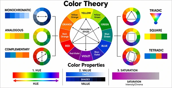
Before understanding which paint needs to be used on which type of wall, we should understand the concepts of colors, which start with color theory. Color theory is the guideline that tells how humans perceive color and how they interact with each other. The theory defines the color combination and helps the designers and artists to make the right and visually appealing choices for painting and drawing purposes.
It consists of many components, like the color wheel, color properties, and color schemes. A successful interior design project demands the perfect balance of these components in the right amount.
1. Color Wheel
The color wheel is a round chart made up of different colors to show the relationship between the different color types. It consists of three types of colors:
Primary Colors: Red, yellow, and blue are three primary colors. These are the bases of other colors we see.
Secondary Colors: Orange, green, and violet are secondary colors. These are made by mixing the primary colors together.
Tertiary Colors: Red-orange, yellow-green, blue-violet, etc., are tertiary colors. They are made by mixing one primary and one tertiary color.
2. Color Schemes
A color scheme is a combination of colors picked from the color wheel to create visual harmony and give an appealing and balanced look if used for painting. There are different types of color schemes that can be considered while choosing the paint colors according to the feel or realm you want to create on your accent walls.
Analogous Color Scheme: Using two shades that sit next to each other on the color wheel. This scheme can be used in bedrooms/living rooms to give a classy look to the walls.
Monochromatic Color Scheme: In this scheme, different tints of a single color are used, like black and grey. This scheme can be used in office space to give a unified look.
Complementary Color Scheme: Using two shades that lie opposite on the color wheel, like blue-orange and red-green. They are mostly used on the accent walls.
Triadic Color Scheme: In this color scheme, the three colors sitting at equal distances are chosen. One color is dominant among all, and this theme can be used in a living room or in a children’s room.
Square Color Scheme: Four colors sitting at equal distances, in which one color is dominantly used at the bottom and lighter shades on the upper parts of the walls.
3. Color Properties
Color properties are hue, value, and saturation. Hue determines the actual color name; value determines the lightness or darkness of a color, and saturation determines its strength and intensity. These properties help to manage the paint color tone and intensity to overall enhance the look of the walls.
Did You Know? : Yellow paint usually dries a shade darker than other paint colors, as it has a natural illuminance, which makes it brighter when the paint dries up on the wall.
How to Choose a Paint Color for Your House Walls?
Choosing a good paint color involves a series of steps, from taking note of your preferences to professionally choosing the perfect tint for your walls. Below are some of the ways on how to choose a paint color for the interior design of your home.
1. Do Some Research
Before you jump on to find a paint color, you can do some basic research starting from your home, like analyzing your needs and what type of look you want to give to your walls—elegant, subtle, warm, or cool. Then surf some online sites to know which shade suits the wall. You can also take the help of the color wheel to understand color combinations. Not only that, you should prioritize whether you want to put focus on walls or on the decor/furniture placed in the space.
2. Choose the Type of Paint Color for the Look You Prefer
For different looks, there are different color options. So you need to select the look you want first and the paint color according to that. Below are the specific paint colors for specific looks.
Delicate and Simple Look: Choose light shades on the top of the wall and darker shades on the lower portion, like off-whites, beige, earth tones, and sage greens.
Elegant Look: You can choose monochromatic or neutral paint colors like ivory, almond, beige, taupe, tan, or garnet to give a wholesome look.
Vibrant Look: Dark shades like red, purple, violet, black, and orange come from this category. You can choose the shades opposite to each other on the color wheel or even experiment with adjacent tones.
3. Check the Undertones
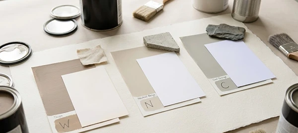
Sometimes, choosing only the paint color doesn’t give us the look we desire; we don’t get it because we didn’t pay attention to the tone of the color. You must check the paint color tone by using the white paper technique: take a swatch of paint on a board and take another piece of pure white paper and look at it under natural daylight. If the white paper looks yellow, cream, or pink as the reference, then it is a warm undertone. If it looks blue, green, or violet, then it’s a cool undertone.
4. Also Consider the Paint Type
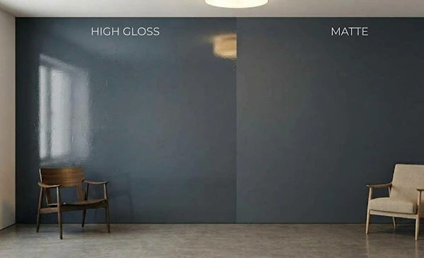
Along with paint color, the type of paint also matters; semi-gloss or satin finish paints reflect more light and highlight imperfections on the walls, while matte finishes absorb the light and make the shade look decent. Choosing a cool undertone paint with warm lighting can ruin the look. Some color combinations for different types of paint finishes are:
Matte Finishes: Warm undertone colors like beige and cream for living rooms and dining areas, cool undertones (sage green and lavender for study rooms and offices), and neutral undertones (off-white for open spaces).
Glossy Finishes: Warm undertones (yellow, beige for kitchens and doors), neutral undertones (blue, green for bathrooms), and neutral undertones (grays or taupes)
5. Test Before You Actually Apply
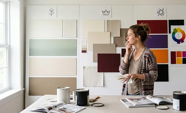
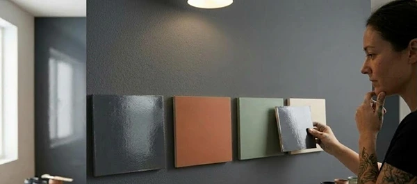
Before putting the paint on the wall, you must try and test by purchasing small pots of paint and applying them to foam boards. Check them in different lighting, like how they look in natural and artificial light. If the paint color you have chosen looks decent in all kinds of lighting, then you can go ahead with it.
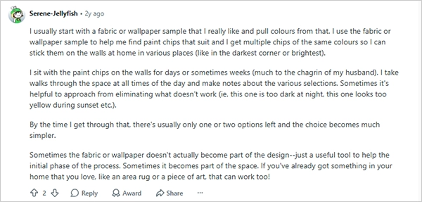
Have a look at one of the Redditors’ advice on how to choose a paint color.
Paint colors vary according to the room type. While the bedroom shades should give you a sense of comfort, the living room should give a warm and ambient feel. The bathrooms should give a classic feel, and the guest rooms should give a welcoming feel. All rooms can be painted in different tones and colors. Some of the best paint color options for every room type are given below.
1. Living Room
The best paint color for the living room can be set for giving a warm, premium, and energy-driven look. For this, using warm undertones works best with combinations like blue and its various shades; green with gray provides a sense of newness; warm shades of brown, soft pink, blue, and grey; and white and gold.
2. Bedroom
A bedroom is the resting place; it should provide peace and comfort. The best paint color for a bedroom shouldn’t be too bold or warm tones that create discomfort while sleeping. Some color options for the bedroom are indigo and white, brown and cream, lavender and off-white, and peach and white.
3. Kitchen
There are various kinds of kitchens, like modular modern kitchens and social kitchens. Wood-themed kitchens, etc. The shade you choose should complement the theme. Below are the colors you can choose for different theme-based kitchens.
Soft Aesthetic Kitchens Colors: Soft pink, cream white, and powder blue work well for brighter kitchens and a fresh look.
Natural Earthy Tones Kitchen: Kitchens with wooden finishes and countertops blend well with earthy tones like brown, beige, and off-white.
Neutral Tones in Kitchens: The neutral paint shades provide a classic look to kitchens, with colors such as beige, grey, and minimal white.
4. Bathroom
Bathrooms are enclosed spaces with no windows for natural light to enter. So, using the dark and warm tones makes no sense in small bathrooms, but for small bathroom remodeling, minimal, neutral tones with a little hue work well. A simple white shade with a hue of blue, a combination of white and a hue of violet, or a combination of white with a hue of lavender makes your bathrooms a comforting space.
Common Mistakes To Avoid While Choosing The Right Paint Color for Your Home Walls
Common mistakes while choosing a paint shade for your home are ignoring the lighting and other important elements of your space, not testing the paint before using it, choosing the wrong undertone, ignoring the type of finish, and not considering the overall look and feel of the house. Below are some of the common mistakes to avoid while choosing the best paint color for your home
1. Ignoring Lighting
People generally forget about the lighting conditions that directly affect the room’s overall look. Different lighting creates different impacts; bright sunlight enhances the warm tones of the room, and LED lighting brightens the neutral shades. So, before selecting the paint color, check the paint colors in different lighting and at different times of the day.
2. Forgetting About the Furniture Paint Combination
If your furniture is traditional and you choose a modern cool tone for your room, then they won’t complement each other. Warm colors such as red, yellow, and orange suit traditional or retro-style furniture, and cool tones, like blue, green, or grey, go well with minimalist, light-colored furniture; neutral paint colors like beige and white go well with any kind of furniture, irrespective of its color.
3. Testing the Paint Colors in the Wrong Way
While testing the shade of the paint, people just take a swatch and apply it on the wall to see if the shade will go well with the wall or not, but this should not be the exact method to test the color; instead, you should select a 1 by 1 foot area of the wall and apply two coats of paint (the second one when the first coat gets dry) and check it for a few days in different lighting conditions.
Wallinsiders Tip: Use a foam core poster board to test the paint color instead of testing it directly on the wall. A foam core plastic board is a stiff board/panel made of polystyrene foam sandwiched between two plastic sheets. It is portable, lightweight, and easy to use for paint testing.
4. Ignoring the 60-30-10 Color Rule
While choosing a multi-colored format for a room, people generally make the wrong color combinations and forget about the 60-30-10 rule. This rule is for a 60% dominant color, 30% secondary color, and 10% accent color. The 60% dominant color would be neutral so as not to overshadow the rest of the colors. The 30% color should be in light contrast to the dominant color to match it to the furniture, and the 10% accent color can vary to be bold, as it takes up the least area and can enhance the fine details of the room.
5. Chasing the Trends Blindly
Homeowners try to follow the existing trends without even thinking about whether the current trend will match their existing room design or not. They choose base paint colors for open spaces to save money; instead of choosing cool or neutral ones, as base paint colors like white, grey, etc., usually cost less than tinted colors. You should carefully choose the paint finish that perfectly matches your personal style and comfort.
The average cost of painting a house depends upon whether it is painted interior or exterior. The cost of interior painting ranges between $1000 to $3000, while exterior painting costs around $1800 to $4500. Various other factors like paint materials, size, location, and labor also affect the total cost of painting.
Painting color choice does not affect the cost much, but the type of finish, the quality, and the brand affect the price. Below is the detailed breakdown of the painting cost by size, material, and labor.
1. Cost by Square Foot
The cost of painting varies by the total square footage of the area to be painted. For the 1000 sq feet home, it can be as small as $2000, and for a large house of 3000 sq ft, it can go up to $18000. Take a look at the table below to see the average prices of interior painting by square foot.
Size of Home (square feet)
Painting Cost (in $)
1000 square feet
$2000 to $6000
1500 square feet
$3000 to $9000
2000 square feet
$4000 to $12000
$2500 square feet
$5000 to $15000
Considering exterior painting, for a 1000-square-foot home, it may cost as little as $1500, and for 3000 square feet, it can go up to $12000. Below is the breakdown of the exterior painting cost.
Size of Home (square feet)
Painting cost (in $)
1000 square feet
$1500 to $4000
1500 square feet
$2250 to $6000
2000 square feet
$3000 to $8000
2500 square feet
$3750 to $10000
2. Cost by Labor
The labor cost depends on the location, the type of work, the professional experience, and the no. of hours they work. Accurate data is not easy to provide, but on average, the labor cost of painting is $55 to $65 per hour and covers 150 to 200 square feet in a one-hour time duration.
3. Cost by Material
Materials include more than just paint. It includes the primer, brushes, tape, etc. A full paint fall-on cost ranges from $15 and goes up to $60 according to the paint type and finish. Primer can cost around $20 to $60 per gallon if you choose the high-performance primer. Other materials like tape, brushes, rollers, etc. add a little to the cost.
The overall cost depends on whether you have hired a professional painter or it’s a DIY project. Professional painting costs more, as it adds the cost of the general contractor and the labor, while DIY projects save that cost and you get the satisfaction of painting the walls on your own.
In this article, we studied how to choose a paint color for your home, paint color according to the room type, house painting cost, and common mistakes to avoid while choosing the best paint color for your home.
To choose a paint color for your home, you must consider the lighting conditions, the color undertones, the correct paint testing procedure, color theory, paint types or finishes that match your wall type, and the overall look that you want to give your house. Remember, a color is not only about what it looks like but also about how it feels when you look at it.
Frequently Asked Questions
How to choose a paint color for your home?
To choose a paint color, firstly do some research on color theory and types, decide the look you want to give your house, check the undertones that match well with your rooms, test the paint on foam boards or your wall, and then finally choose the best-suited paint color.
What is color theory?
Color theory is the guideline that helps artists, house painters, and designers to know the relationship and interaction between the different colors on a color wheel.
What is a 70-20-10 rule in painting?
The 70-20-10 rule represents the three portions of a wall, where 70% is for the dominant color, 20% for the secondary color, and 10% for the accent color.
How does lighting affect the paint color?
Different lighting has different impacts on the paint color. In the natural light of the sun, the paint color is the same as it is. In artificial light, like LED lighting, the paint color’s undertone looks bluish, and in warm-colored lighting, it looks yellowish.
Which colors should be strictly avoided while planning for a decent look for your home?
Shades like bright red, loud yellow, dark red, or dark forest green should be avoided while planning for a decent or neutral look for your home, as they overwhelm the eye and ruin the overall look of your home.